CrestCore reveals new artwork in the main Conference room!

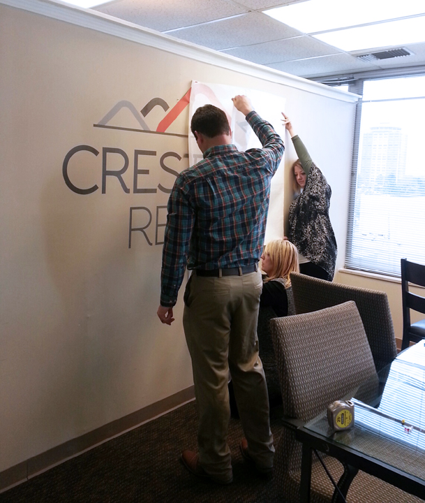
Sandy Branson, Liz Parr, and Ben Trombly pictured working hard on installation of new decor.
When CrestCore was first developed, there was a strong desire to create a relevant logo that had strong imaging as well as a strong meaning and message that coincided with the company’s mission and principles. They reached out to designer Charles Vance with Redrover for help and gave him a description of what they were looking for to represent CrestCore. Below is brief description of how CrestCore’s logo came to be:
“The concept was to present CrestCore as a realty company – that also thrives on the management of residential property. The “crest” of the house was used, as that was the only direct connection to the name. While one central home visually represents the client’s first (investment) home or most prized home, there are additional homes surrounding it to indicate a “portfolio” of investment homes. CrestCore’s business model feels more like an investment firm – hence the need to create something that visually represented – wealth accumulation (much like a portfolio of stocks/bonds).
The logo is layered (stacked) to allude to progress. The crest of each house becomes an abstract arrowhead… pointing upward… again, progress, growth and wealth accumulation.
The colors were chosen to produce contrast. The gray is a grounding color while the orange is used as the “impact” color. The impact color speaks, again, to progress and energy.

